A couple of days ago Midjourney announced v5.2 update with some super exciting new features like zoom-out and /shorten commend to analyze our prompts.
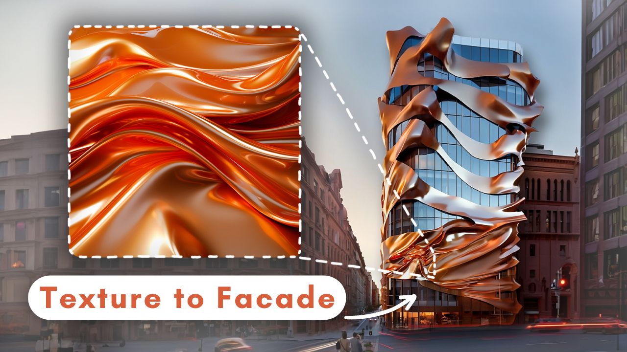
I had some experiments with it which was quite fun, especially with the new zoom-out feature to create these images, and these ones starting from a simple texture like this to achieve something like this. Before we start on that let’s talk a bit about the other parts of the update.
They stated that the —stylize parameter had some changes and now it is much more sensitive. And as far as I see since the update, we need to use lower values than previous models to achieve a similar stylize effect because, with larger values like 600-700, I feel like it’s slightly easier to get some weird, mixed up images compared to previous 5.1 version.
If you experience this too, try to lower the s value.
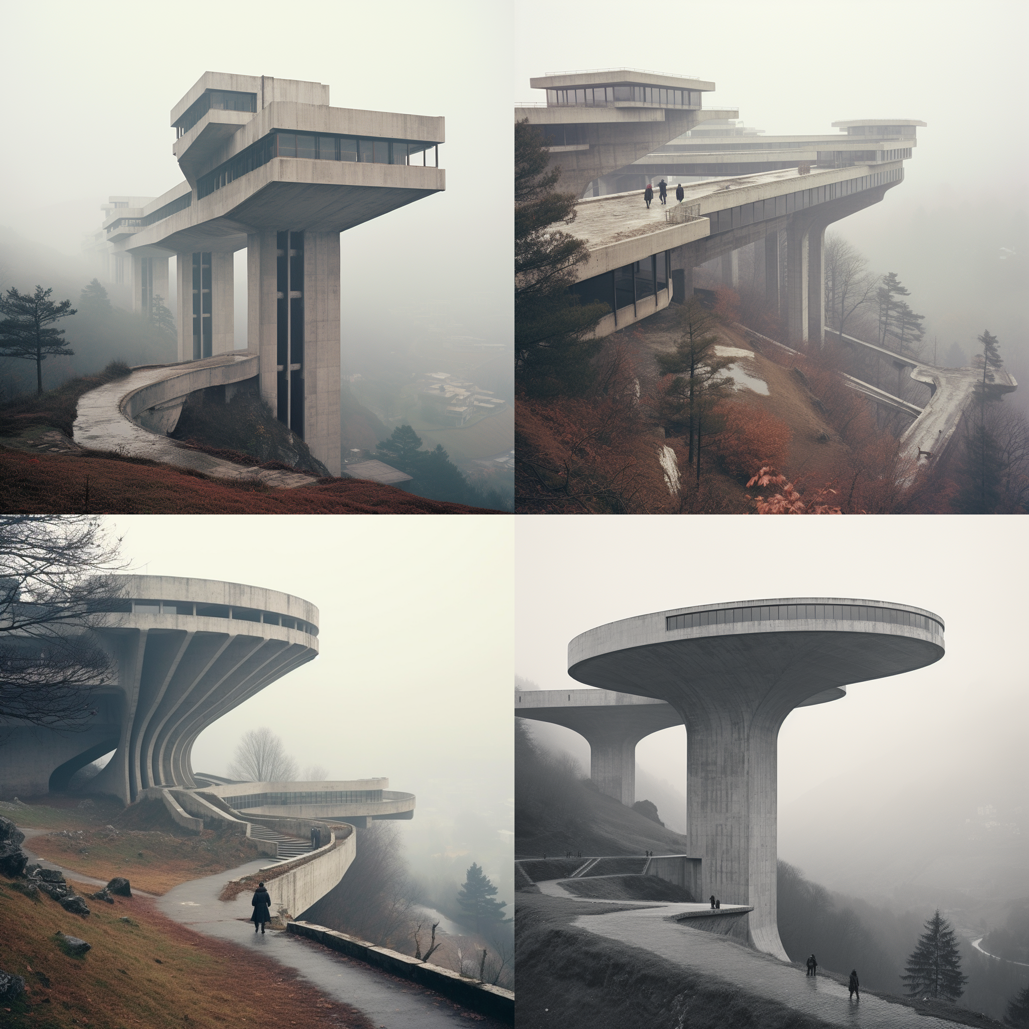
The Midjourney team announced a few new announcements like —fast and —relax parameters to be able to change it in each individual generation, —video commend support for v5 and niji5 models to create animation like this to show progress and it works with zoom-out feature too. So we can see how the zoom-out process works in this one with outpainting.
And they pointed out this issue with the stylize, as we said before, you need to lower the value dramatically for v5.2, it is 5 times stronger now. So —s 1000 in v5.1 is equal to —s 200 in v5.2.
In addition to changes in stylize, zoom out, and shorten commend, now we can change between high and low variation mode, which is a nice option to have. High variation mode is quite nice to generate options with the same kind of materials, and vibes but different forms, and shape options whereas low variation is more useful to try fixing some minor issues you don’t like in the image. Like with the low mode you can generate slightly different forms for this facade and choose the one that makes more sense, but if I use high mode, these are the options I got.
Zoom-Out
We have the zoom-out feature as outpainting in Stable Diffusion together with inpainting for a while. Before this update, I was usually just using Photoshop Generative Fill to extend the canvas. Which works quite smoothly but having this feature directly available inside Midjourney is just way more convenient.
The possibilities with zoom-out are endless but what I found works really nice is to add more depth to the image. Usually, the composition you receive from midjourney can be quite generic but with zoom-out, we can change the composition.
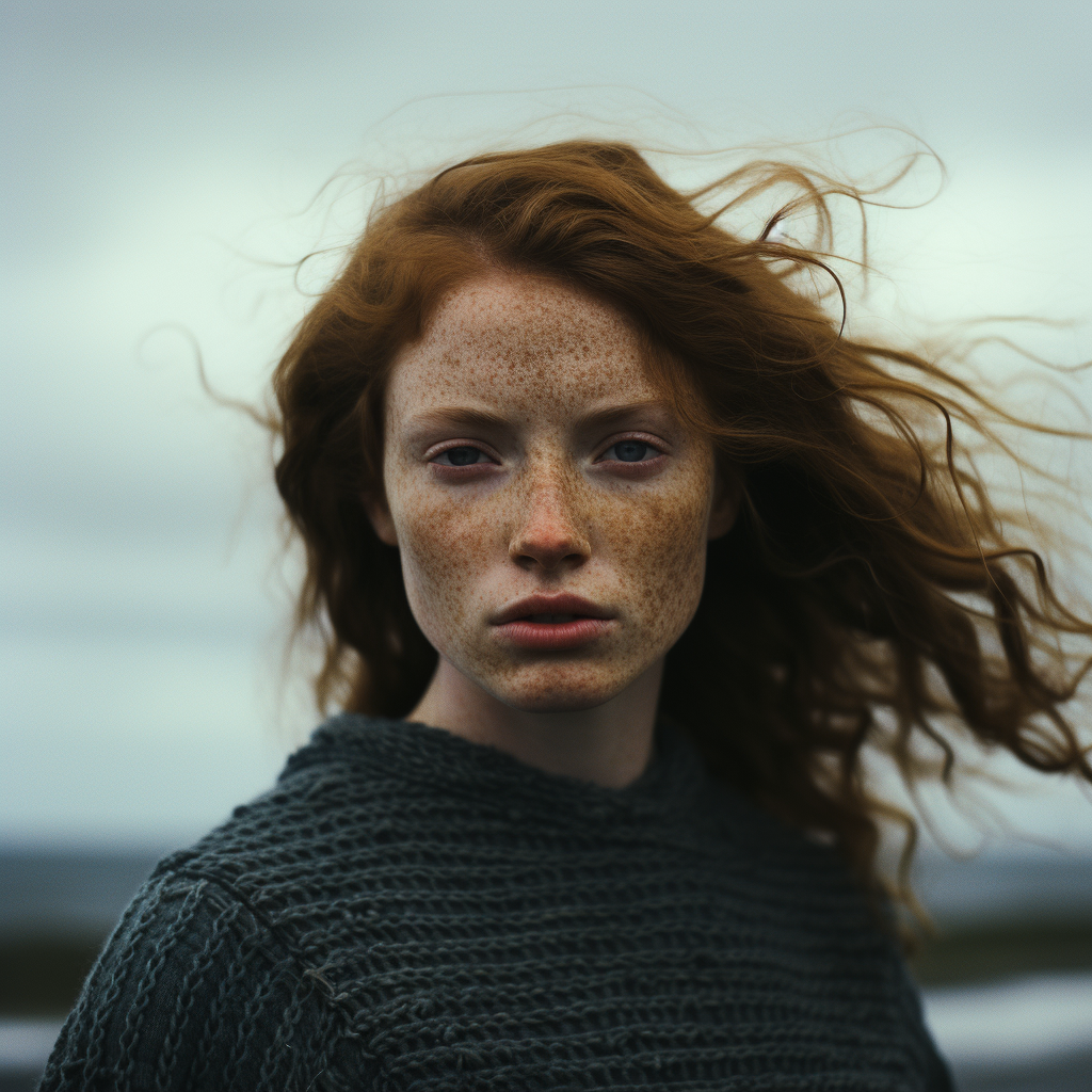
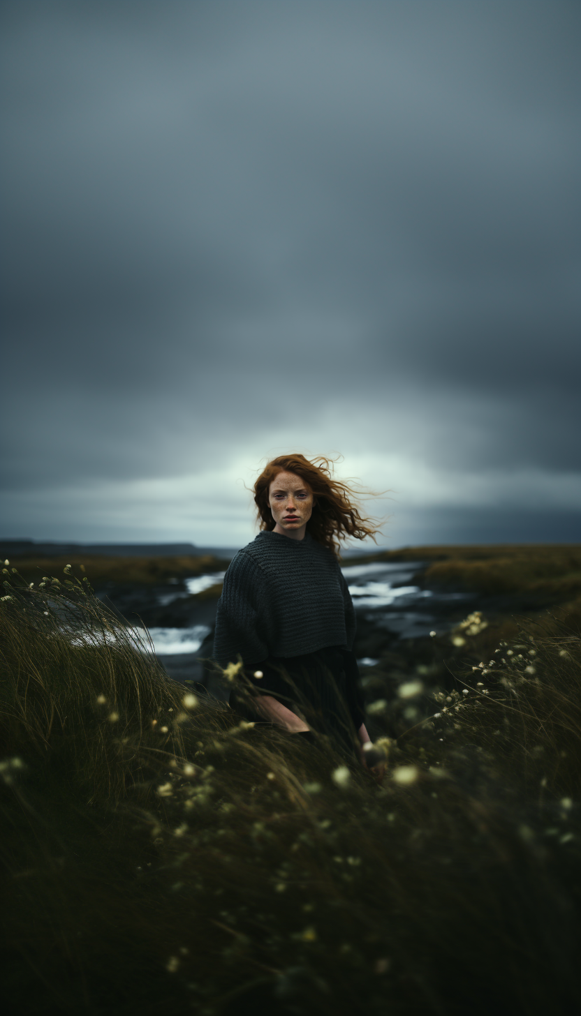
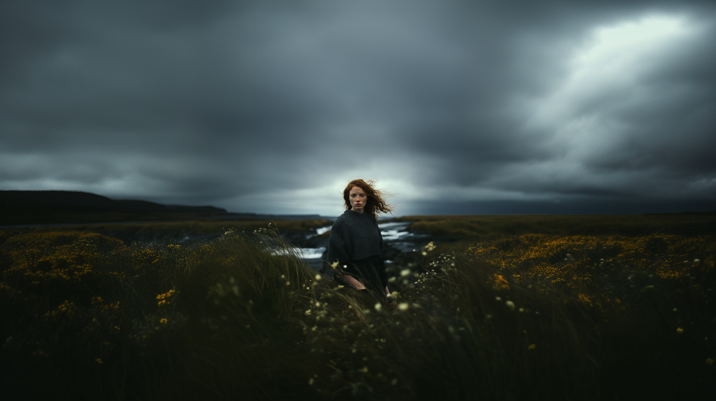
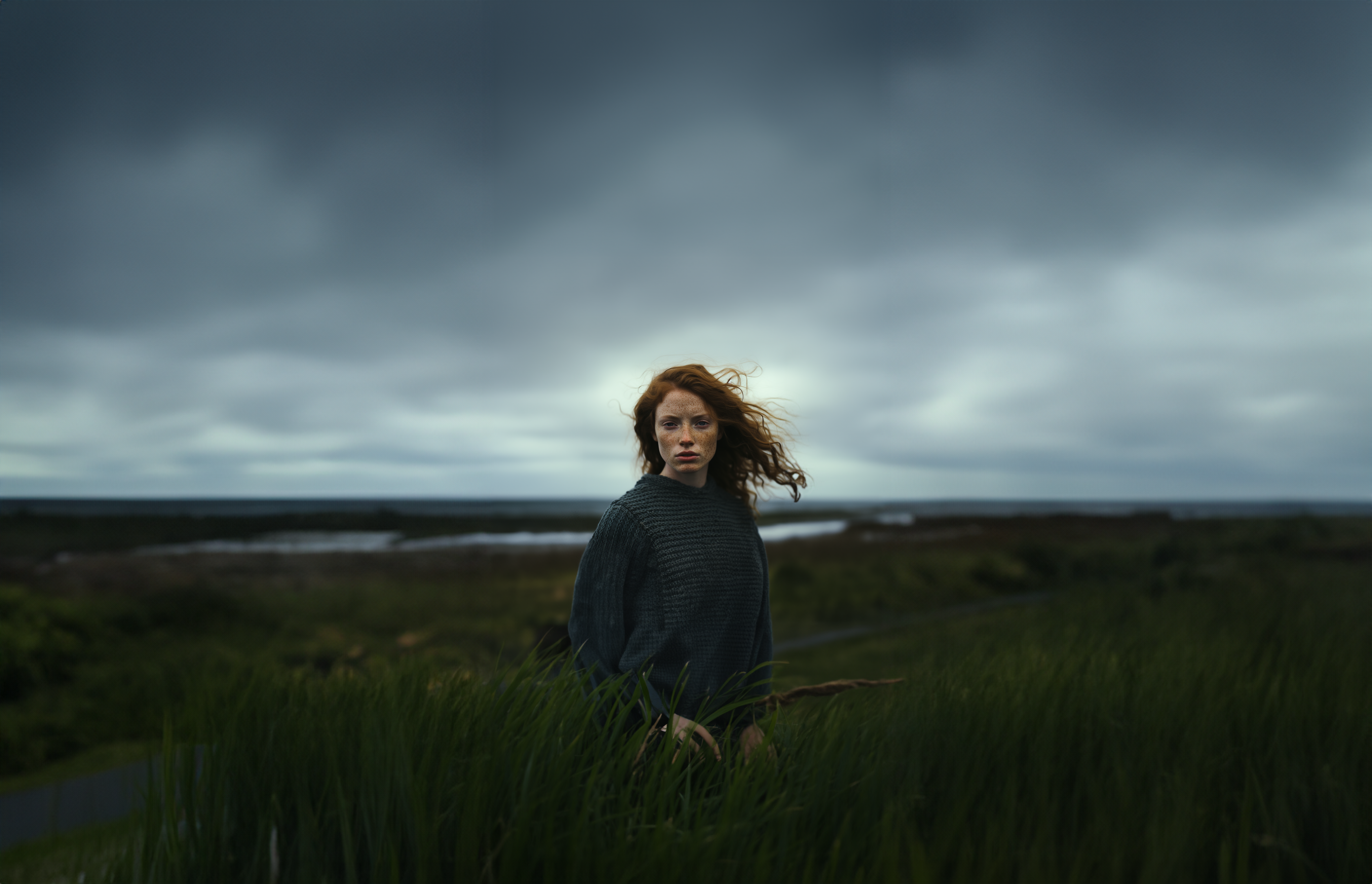
Like this portrait photo of this woman is absolutely amazing, I really don’t think anyone can say this picture is not real but we can make it better.
I zoomed out once with 2x, and now we have these long grass plants in the foreground and it created this depth effect, which looks pretty cool I think.
Another cool addition to the zoom-out we can easily change the aspect ratio of an image we like without going to any other additional software. You can click custom zoom, change the aspect ratio you want and use —zoom 1 so it won’t zoom out but only change the aspect ratio of the original image.
Or you can just use it to create an infinite zoom effect like this. A couple of months ago I tried this for the first time with an extension on Stable Diffusion, here are the comparisons.
Texture to Design
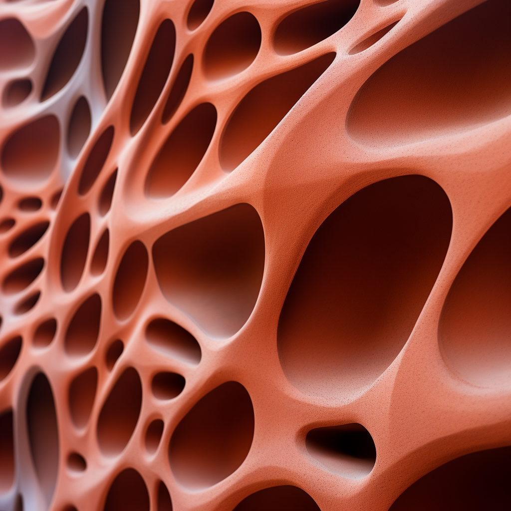
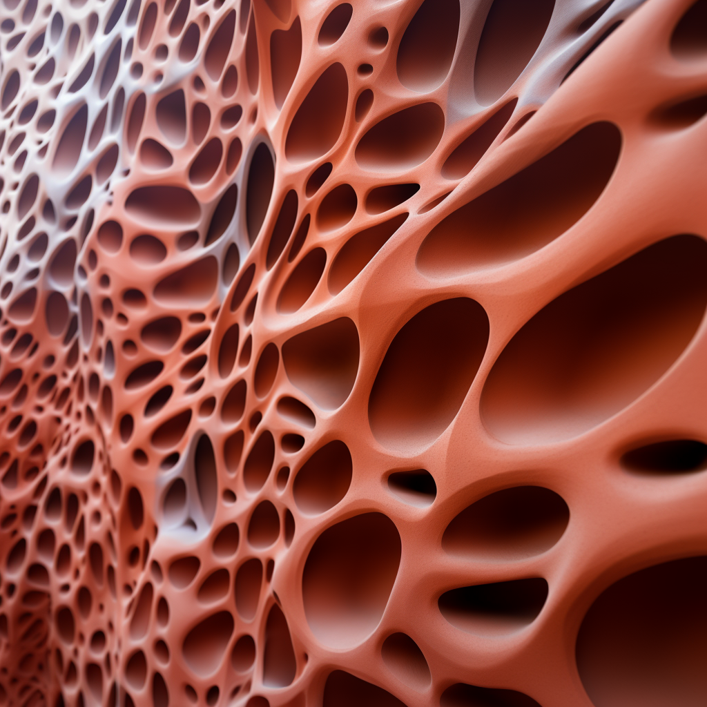
I thought if it would be possible to generate a simple pattern texture, maybe even with the —tile command so it will be seamless and then somehow transfer that pattern into the building facade material. So you can have more control over all the small design details. Because it is easier to just create the texture first and then use that constantly throughout the design.
First I will just create a seamless texture, actually, it doesn’t need to be seamless but it’s up to you. I want to create a clay-like material maybe for a 3D-printed facade.
Once I like one of the textures, I will upscale it, and different from previous versions now we have these zoom out buttons as 1.5x zoom, 2x zoom, and custom zoom.
If you just simply want to zoom out, you can choose directly 1.5 or 2x zoom option. But I think most of the time you will choose custom zoom. Because once we click on the custom option, similar to the remix mode we have this additional prompt box where we can add a new prompt to affect the zoom-outed version of our image, and in addition to that we can specify any value between 1 and 2.
I will change the prompt slightly to transform it to a facade of the building. I added “architectural elevational shot, close-up view, curved shaped windows on the facade” and generate.
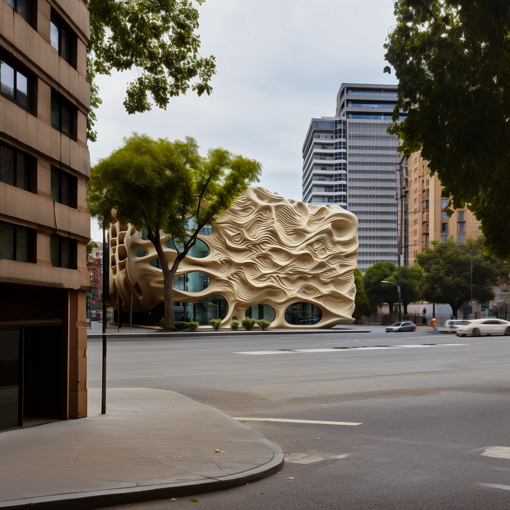
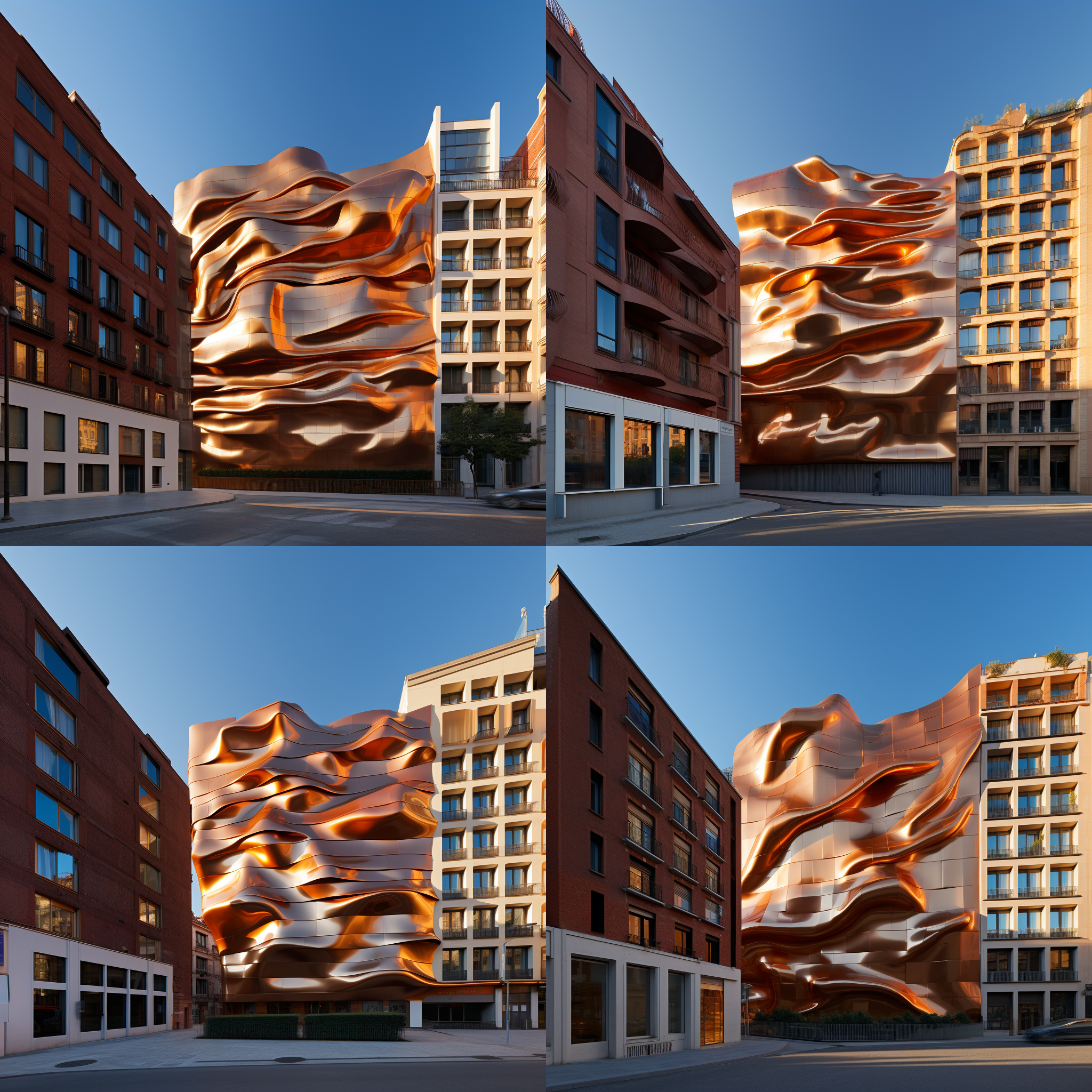
Then we get something like these ones but the shapes are too big I want a tinier version so let’s go back one step back. I will zoom out once without changing the prompt just to have smaller shapes and then we can add some features as a building facade.
As you can see now it’s more dense with smaller patterns and now I will do the same as before.
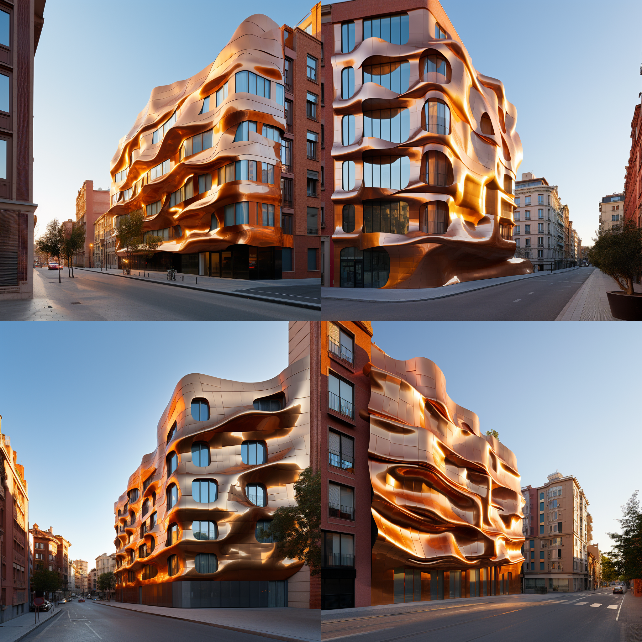
It’s much better now. I will keep repeating the same logic couple of times more. And in the next one, I will remove keywords like “close up shot” from the prompt because we will start to see the whole building facade as a wide shot.
Another trick we can use to control composition a bit better is if you want to see for example this upper part more we can use custom zoom, change the aspect ratio to something portrait like 4:5 and keep the —zoom 1 so it won’t zoom out just add more details to the top and bottom part of the image. Once you like one of them you can use the make square option to zoom out more and change the ratio of the image back to square if you want to.
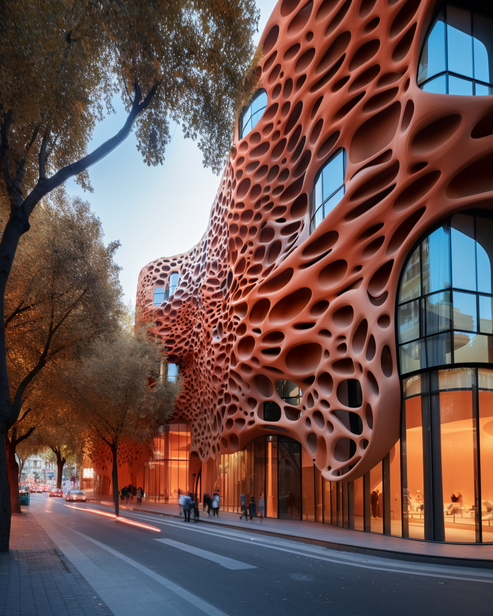
And after a couple of more generations, we have something like this as a final image. Of course, you can continue zooming out infinitely but after some point, you will start to get a weird fish-eye effect like this so it’s better to keep it at some level.
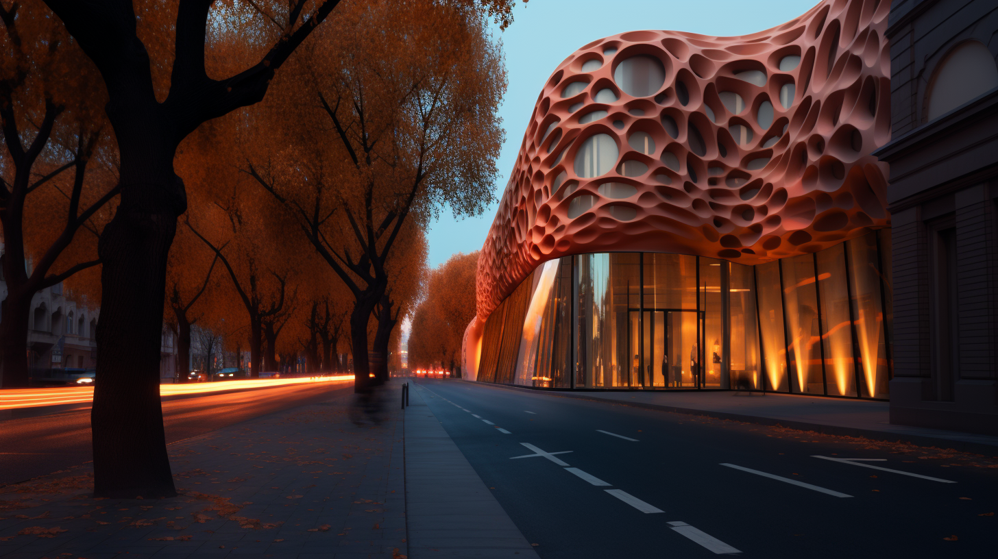
Here are some of the other ones I created like this.
An important reminder about the zoom-out, keep in mind that it doesn’t actually change the image resolution size so the images you generate are still the same size. So if you zoom out a lot you will start to lose lots of details from the initial image.
I am planning to make another more detailed video about this workflow, please let me know in the comments if it’s something you are interested in.
Shorten
Another really amazing addition we have with this update is the /shorten commend. It didn’t get lots of attention as zoom out because it doesn’t have a direct effect on the final images you generate.
But I think it’s an even more important feature than outpainting. Because it lets you understand how actually Midjourney is thinking. Up to this point, we didn’t have any option to understand this other than trial and error.
Now you can copy a prompt to shorten and it will create a report showing which keywords will have the most and least effect on the image. The ones with the bold mean they are important ones with major effect, normal ones mean they will have some effect but nothing significant, and if it’s crossed like this Midjourney will completely ignore them.
On the lower side, we have 5 options for our initial prompt with the most important keywords and it keeps shortening till the last one.
And if you press the show more button, we will have an even more detailed report with the exact factor of each word together with this graph showing the most important top 5-6 words.
I think it’s really useful to understand how to create better prompts with this new commend.
After I tested out some prompts, I figure out that if there is a specific location most of the time it becomes the most influential part of the prompt and in addition to that most of the time artist names have a dramatically high effect.
Another thing I realized is, I was thinking keywords like 8k didn’t have any impact over the image in Midjourney so I was never using it but according to the shorten command, it does have some effect because, in all of them, it was bold. So I tested out the same prompt with the same seed number once with and once without the “8K” and here are the results, so you can compare it yourself.
Do you think adding keywords like 8K improves the overall quality?
And lastly, I wanted to see how actually these super-long prompts work. I don’t think they work nicely but let’s see. I will use this prompt from the Midjourney subreddit
modern building, full body, Daido Moriyama style, extremely detailed with rich colors Photography, elegant, complex light machines, F/2.8, high Contrast, 8K, Cinematic Lighting, ethereal light, intricate details, extremely detailed, incredible details, full body, full colored, complex details, by Weta Digital, Photography, Photoshoot, Shot on 35mm, Multiverse, Super-Resolution, ProPhoto RGB, Lonely, Backlight, Rim Lights, Rim Lighting, Natural Lighting, , Moody Lighting, Cinematic Lighting, volumetric Light, Volumetric Lighting, Volumetric, Contre-Jour, Rembrandt Lighting, Beautiful Lighting, Accent Lighting, Global Illumination, Ray Tracing Global Illumination, Optics, Materiality, Ambient Occlusion, Scattering, Glowing, Shadows, Rough, Shimmering, Ray Tracing Reflections, Chromatic Aberration, CGI, VFX, SFX, insanely detailed and intricate, hypermaximalist, elegant, ornate, hyper realistic, super detailed whole body, complex details, movie lights, gold design, ilusory engine, octane renderingAs we can see, after some point Midjourney just ignores everything. So if your prompt is longer than 50-60 characters long, whatever you add after that will get ignored so keep this in mind and try to keep it short.
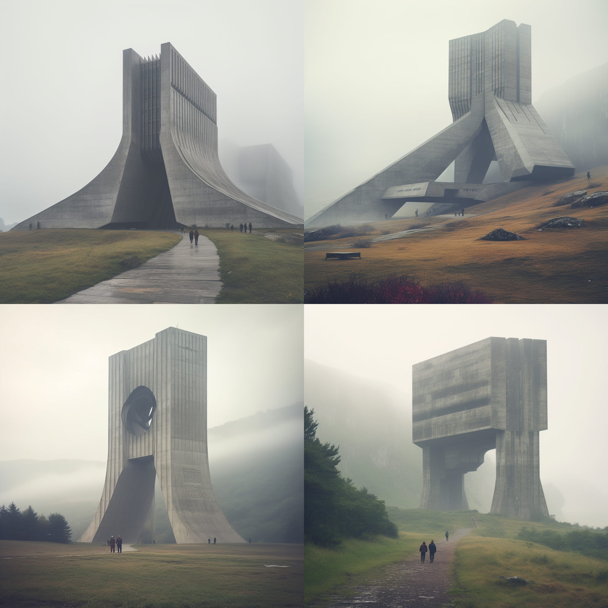
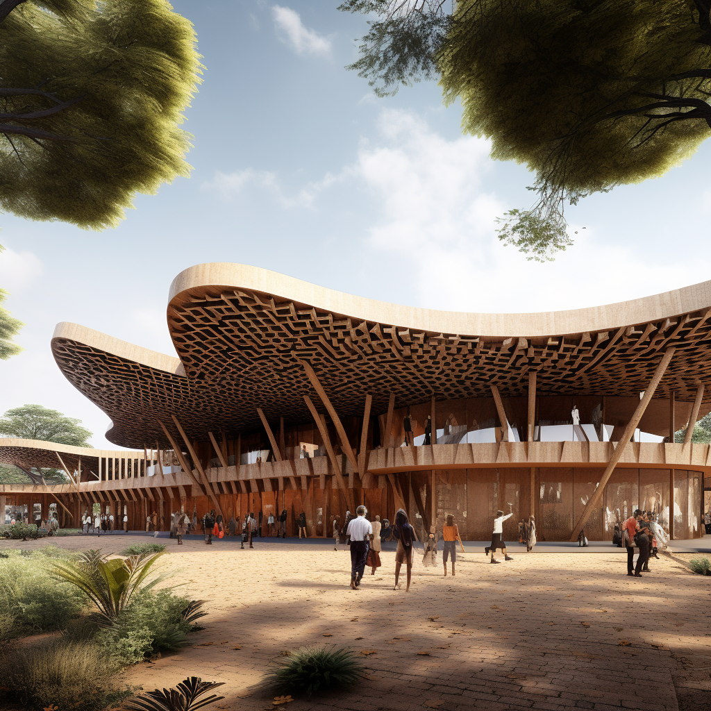
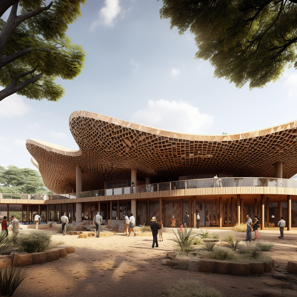
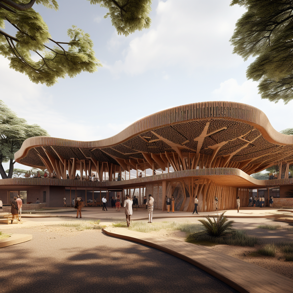
Organic formed modern building in the city center covered with pentagon metal sheets, a building facade with hundreds of pentagon metal sheets, view from the opposite street, trees in the foreground, bright lighting, a curtain moving in the wind, other buildings around, rainy day time, bright sunlight, global illuminationHyper realistic mid size color, zoomed - out view, a building covered with purple and green gradient tiles, curved formed building designed by Gaudí located in a modern urban context in perfect morning urban environment and illumination, city lifeVast landscape, dozens of huge Yugoslavian monuments brutalist architecture, futuristic nomads wandering around the base of the monuments, light foggy atmosphere, realistic photograph, 8k, very detailed, film photography by Julius ShulmanModern luxury residential house in New York realised by plastic slides pipes that wraps all around the volume of the building, award winning photography, street photography with people walking past the buildingSmall primary school africa, modern, traditional, constructivism, Francis Kere, Kengo Kuma, Clay facade, wood construction, parametric metal roof, mir render style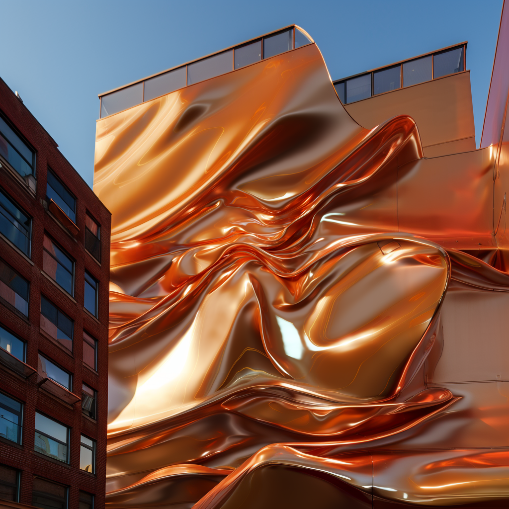
High-Low Variation
I was not using the variation button too much till this update because normally it was affecting the overall image very little. If you are lucky maybe you could fix some minor parts you don’t like. But now with the new update if you change it to “High Variation Mode” it actually changes significantly while keeping the overall vibe the same. And I think it’s a nice option to create alternatives once you like one of the images.
We have these two options for each upscaled image to create variations. I will generate both options for this image we generated and here are the results with original, low and high variation modes.
In the low mode, the camera angle, overall building position, and the shape is the same but it adjusted the facade a bit and created different kinds of openings.
But on the other hand with the high mode, we have completely new camera angles, and volumes with the same material and overall vibe, and color palette.
This mode also affects the normal variation button so I’ve created variations for this image of a school project with both versions. You can see the low mode on the left and the high mode on the right side.
What do you think about this 5.2 update? I hope you liked the video. Please let me know if you are interested in a more in-depth “texture to design” tutorial, if so I can create a video about it.
I have posted all of the images from the video on my Instagram account, you can find them there, and see you in the next video!


 Just occasional emails with great value!)